.svg)


This guest post about the power of color in the workplace, comes from Emily Johnson.
“The soul becomes dyed with the color of its thoughts.”
– Marcus Aurelius
Have you ever wondered why stop signs are red and life jackets orange? We can find the reasons for these things in human psychology.
It’s a well known fact that red is a prominent color that symbolizes power, danger as well as energy. Orange, on the other hand, stands out in water and is associated with strength and endurance. No wonder, then, that red is the color of traffic signs, and orange of safety vests.
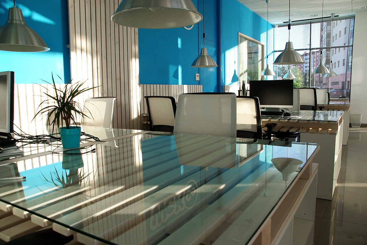
Did you also know that companies use colors to establish their brands and identities? Some employers use color psychology to evoke certain feelings and emotions in their employees or customers. How is that possible?
Let’s discover the true power of color. That way you can design your office to make your employees feel better, enhance their enthusiasm, and boost their performance!
The Power of Color: Red
Red is the color of fire and blood. It’s identified with danger, energy, strength, determination, love, passion and desire. Red is also known to have physical effects on our bodies: it raises blood pressure, increases heart rate and fuels metabolism.

Because red is a color that stands out and draws attention, make sure to paint in red anything that you want your employees to remember. Also, if employee tasks involve any type of physical activity, consider painting the surroundings in red. This will give your employees a mental productivity boost.
It’s also a good idea to make a small gym in your workplace and add a red touch to it. This way you’ll encourage exercise and you’ll help your employees stay healthy at work.
Otherwise, be careful with using the color red! It can make your employees feel anxious. So the best strategy would be not to use red as the main color, but as an accent in interior design.
Red is best for: gyms and fitness studios.
The Power of Color: Blue
Blue is the color of sky and sea, and it symbolizes depth and stability. It also stimulates our minds and is associated with feelings of trust, tranquility, confidence, loyalty, and intelligence.
When used in a workplace, blue has a calming effect on employees and so, reduces stress. It also helps to better concentrate on a given task and thus, increases productivity.
Though, be cautious when using blue if you run a business that promotes food, cooking, or baking. Blue is un-appetizing! It slows down the human metabolism and suppresses appetite. Also, pay attention to the tone of blue color – darker shades evoke sadness.
Blue is best for: counseling rooms, psychiatrist clinics, and law offices.
The Power of Color: Yellow
Yellow is the color of sun and light. It produces warming effect and stimulates mental activity. Yellow is also a color of joy, fun, happiness, energy, optimism as well as intellect, idealism and imagination.
Since yellow is a warm color that stands for imagination, you can use it if you want your employees to be more creative. Be careful, though, if you want to evoke feelings of stability and safety! Yellow is a color of cheerfulness and spontaneity. It doesn’t stand for protection or security.
Also, be mindful of the shade of yellow you use. Light yellow walls will bring warmth, freshness, and joy into a workplace. On the other hand, dark yellow walls might send a message of illness or decay.
Yellow is best for: graphic or fashion designer rooms, writing studios, and visual arts centers.
The Power of Color: Orange
Orange is a citrus color and it’s associated with Vitamin C as well as healthy diet. It symbolizes enthusiasm, encouragement, strength, endurance, balance, and excitement. Orange is hot, but not aggressive and it’s accepted by young people. It also has several effects on our physical health: it increases oxygen supply to the brain, stimulates brain activity, and energizes.

Image credit to Festoon Fairy Lights
Being the color of autumn leaves, orange stands for change. Paint your walls orange if you want to help your employees make decisions, boost their self-confidence, and enhance understanding. If your employees have to communicate a lot, make sure their surroundings are orange as well! The color will help them socialize, increase their inspiration and make them love their workspace even more!
Also, check what message different shades of orange send to people:
- Dark orange – deceit and distrust.
- Red-orange – passion, action, and domination.
- Golden-orange – prestige, wisdom, and wealth.
- Peach-orange – friendliness and delicacy.
Orange is best for: call-centers, consulting firms, IT companies and tourist information centers.
The Power of Color: Green
Green is a color of nature and new life. It’s associated with harmony, growth, hope, fertility, trust, wisdom, faith and renewal. Since green is known to symbolize free passage, it’s a color of safety.

Green is also known to slow human metabolism. And just as blue, green produces a calming effect. You might introduce green into your workplace if your employees have stressful jobs or suffer from work depression. Green is alleviating, so it’ll make them feel more comfortable while working.
Also, green is the best color for those who work long hours. It’s restful and improves vision. So, if your employees have long shifts, help them go through them by adding more green to their surroundings.
Green is best for: dental clinics, counseling and psychiatric clinics, kindergartens, and art therapy centers.
The Power of Color: Purple
Purple is the color of hyacinths. It stands for luxury, power, ambition, wisdom, dignity, independence, vitality, spirituality, as well as mystery and magic. It has the power to uplift spirits and calm the mind and nerves.

You might want to paint your workplace interior in purple if your employees deal either with children or the elderly. Purple is known to increase nurturing tendencies as well as sensitivity. It also encourages imagination and makes people more creative. So if you want your employees to come up with original ideas, paint the walls lavender!
Although purple makes people more delicate, it also sends a specific message to your customers. Purple is a color of richness, comfort, and independence. So, use it to your advantage!
Also, be mindful of the shades of purple. Each tone sends a different message.
- Light purple/lavender – evokes romantic and nostalgic feelings. It stands for grace.
- Dark purple – makes people sad and frustrated.
- Bright purple – stands for richness and royalty.
Purple is best for: arts studios and beauty clinics.
The Power of Color: White
White is the color of snow. It’s associated with purity, goodness, illumination, cleanliness, and perfection. In western countries, white is the color worn by brides as a symbol of innocence and virginity. In eastern countries, white stands for mourning and funerals.

If you paint your walls in white, you suggest simplicity and a successful beginning. Be cautious, though! Too bright a white can cause headaches!
White is also known to clear people’s minds, encourage pure thoughts, cleanse negative emotions, and promote renewal.
White is best for: hospitals, charitable organizations, veterinarian clinics, medical centers and laboratories.
The Power of Color: Beige
Beige is a neutral color that symbolizes dependance, conservatism, and flexibility. It’s quiet, calm, and often elegant. Because beige is a relaxing color, people tend to overuse it. Thus, many find it boring and dull.

Whereas beige is thought to be ordinary, it’s a color that helps people relax. It has the warmth of brown and coolness of white, which makes it perfect for home interiors as well as offices where employees work on computers.
Since it symbolizes work, you might paint your walls in beige if you want to promote hard work in your company.
Beige is best for: offices of computer programmers and web developers, writing studios, banks as well as hotels.
The Power of Color: Black
Black is the color of night and shadows. It’s associated with power, formality, elegance, seriousness, professionalism as well as mystery and death. Black has also got a negative connotation (black humor or black death) and produces feelings of fear of the unknown (black holes).

You can use the color black if you want to add a sense of formality to your office. Be careful, though, with using black as the background for text on walls – it diminishes readability.
Black can also evoke deep emotions, but too much of it is overwhelming. It makes people inconspicuous, increases their sense of possibility, produces feelings of emptiness as well as gloom and sadness. So, don’t overuse it!
Black is best for: offices of financial advisors and consultants, as well as for law offices.
Are there colors you should avoid?
While designing an office for your employees, try not to paint walls in:
- Brown – it makes rooms seem dark and gloomy.
- White – although it’s associated with cleanliness and purity, it’s the color of hospitals.
- Pink – it’s distracting, so your employees will find it hard to concentrate.
Now you know the hidden meanings behind 9 of the most common colors in the workplace. So, you can start designing your own space with the power of color in mind.
If you need additional tips on how to, for instance, organize space in your office or how to make renovation that won’t cost a fortune, check 5 essential elements of office design.
Now, since you have all the necessary knowledge about office design, you’ll surely manage to make a pleasant environment for yourself and your employees.
Be creative!
About the author
Emily Johnson is a blogger and a content strategist at omnipapers.com. She is also a contributor to many websites about career advice, productivity, work issues, blogging and writing. You can find her Twitter.